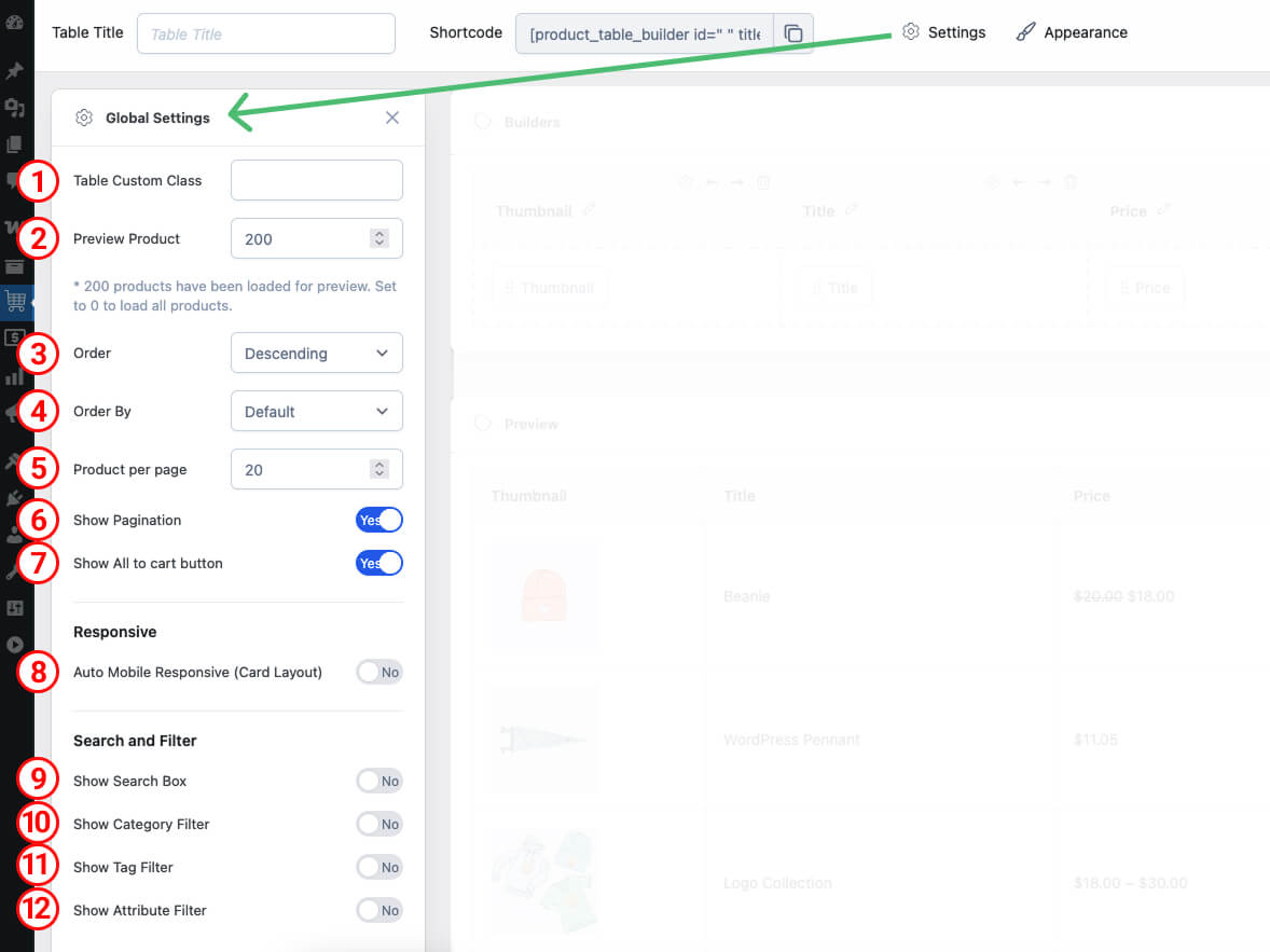
1 Table Custom Class
Input Field: Use this field to add a custom CSS class to your table. This allows you to apply specific styles to your table by targeting the custom class in your stylesheet.
Example: my-custom-table
2 Preview Product
Input Field: Define the number of products to be loaded for preview in the backend builder. This setting helps manage the preview experience when building the table in the backend.
Default: 200
To show all product, please set -1 in the product preview field
Note: This setting only affects the preview in the backend and does not impact the product display on the front end.
3 Product Order
Options: Set the default order for the table data. You can choose between ascending (ASC) and descending (DESC) order.
Values:
ASC– Ascending orderDESC– Descending order
4 Product Order By
Options: Specify the column by which the table data should be ordered. This should match the column name or identifier used in your table data.
Example: Popularity, Price, Rating, Reviews Count, Title, Slug (URL), Date, Date Modified, Rand, ID, Author, Type, Parent, Relevance, None
Default: ID
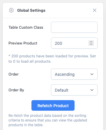
Note: When you adjust the Preview Product, Order, or Order By settings, a “Refetch Product” button will appear. Click this button to reload the data according to the updated settings.
5 Product per page
Checkbox: Define the number of products to display per page. This setting works in conjunction with the pagination feature to control how many rows of data appear on each page.
Default: 10
6 Show Pagination
Checkbox: Enable or disable pagination for your table. When enabled, the table will display a set number of rows per page and provide navigation to move between pages.
Default: Checked (enabled)
7 Show All to Cart Button
Checkbox: Enable or disable the “All to Cart” button. When enabled, this button allows users to add all items in the table to their cart with a single click.
Default: Checked (enabled)
8 Auto Mobile Responsive
Checkbox: Enable or disable automatic mobile responsiveness for your table. When enabled, the table will adjust its layout to be user-friendly on mobile devices.
Default: Unchecked (disable)
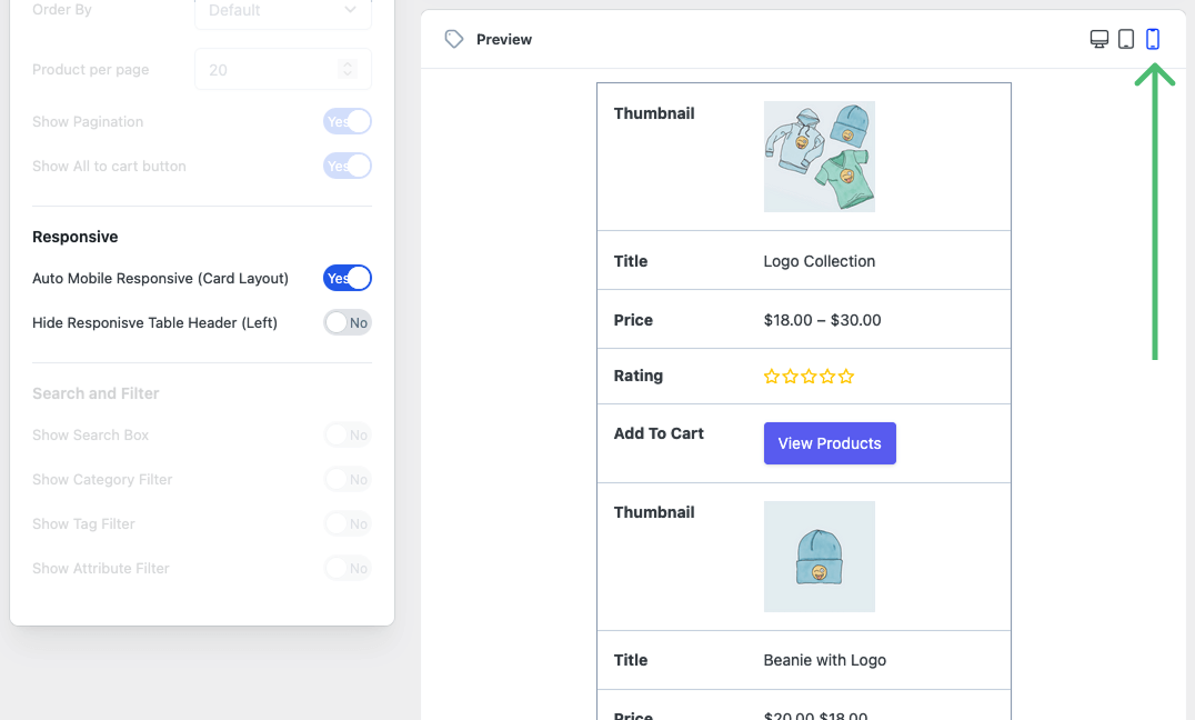
Note: If you enable Auto Mobile Responsive, click the mobile preview icon to see how the table will appear on mobile devices. Additionally, there is a secondary option called Hide Responsive Table Header (Left). Enabling this option will hide the left-side column titles in the table.
9 Show Search Box
Checkbox: Enable or disable the search box for the table. When enabled, users can search for products in the table by entering a keyword.
Default: Unchecked (disabled)
10 Show Category Filter
Checkbox: Enable or disable the category filter for the table. When enabled, users can filter products based on categories.
Default: Unchecked (disabled)
11 Show Tag Filter
Checkbox: Enable or disable the tag filter for the table. When enabled, users can filter products based on tags.
Default: Unchecked (disabled)
12 Show Attribute Filter
Checkbox: Enable or disable the attribute filter for the table. When enabled, users can filter products based on custom attributes.
Default: Unchecked (disabled)